TWO LANGUAGES, ONE MAP
In 2018, the Government of Ireland launched Project Ireland 2040, an ambitious initiative to transform the nation’s infrastructure. One of its standout projects was Metrolink—a revamped Metro North service that would link Dublin City Centre to the airport, seamlessly integrating with the existing Luas Green Line. This would create a continuous metro line running from the northern suburbs to the south, a major step forward in enhancing Dublin’s public transport network.
However, the announcement led to widespread confusion about how Metrolink would coexist with the Luas Green Line. To address this, I designed a map that not only outlined the Metrolink but also showcased all planned transit lines for the next two decades, providing clarity and context to the broader public transport vision. The map included innovative features like the DART Circle—a new line encircling the city core, using the existing Phoenix Park tunnel and the future DART Underground. This would allow for a more efficient two-line DART network, improving capacity and reducing congestion on key routes. I also highlighted the southern section of the Metro Orbital, connecting Tallaght to Sandyford, further enhancing connectivity.
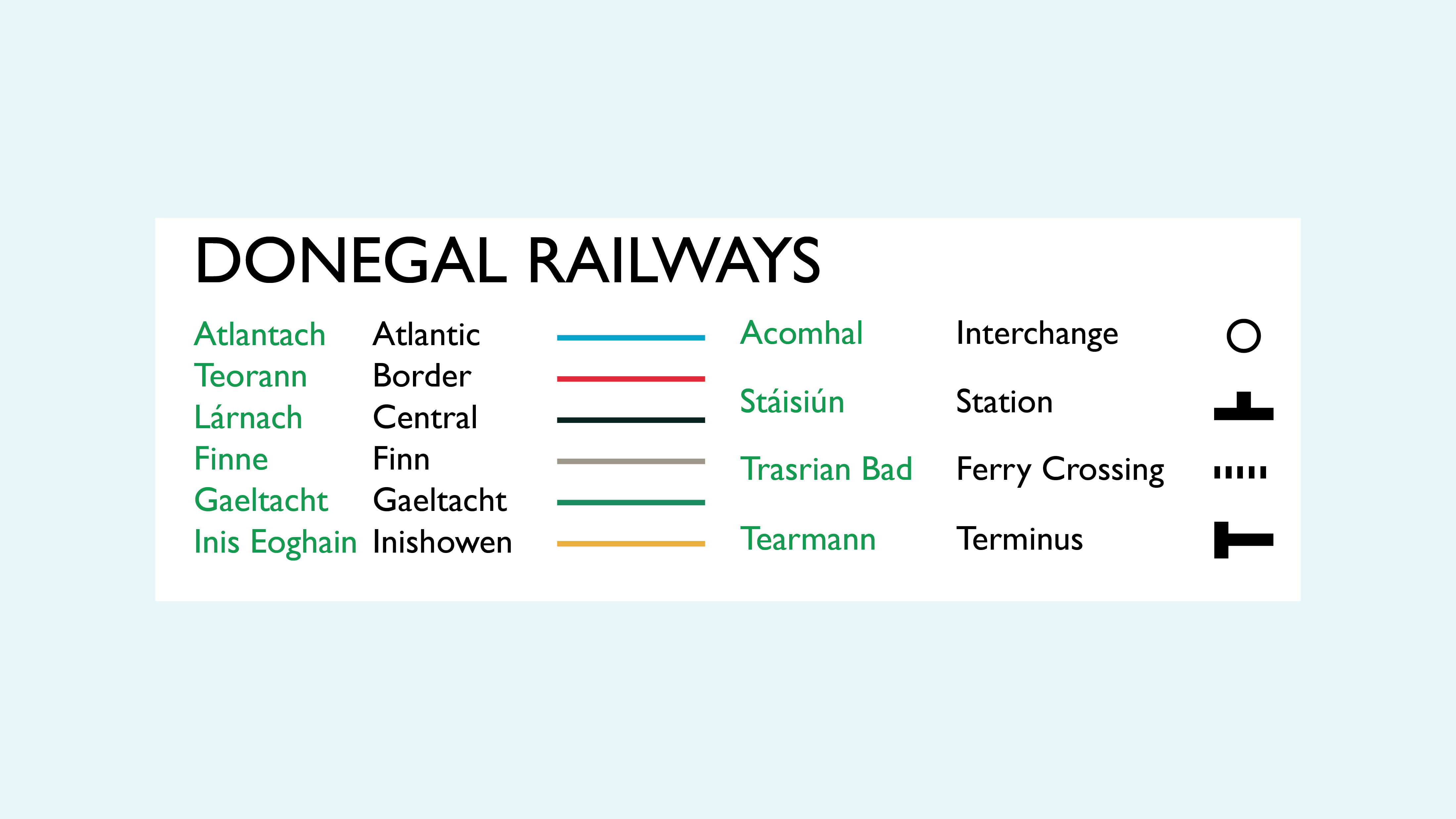
To maintain consistency with Transport for Ireland's visual identity, I used their branding elements—incorporating their colours, logo curves, and the Gotham typeface, rather than the usual Univers font. A crucial aspect of this map was its bilingual functionality. As required by law, the map was presented in both Irish and English. More than just a legal obligation, this also reflected my passion for the Irish language and its cultural significance. For example, I renamed the Orange line, initially called Metro West, to the Metro Orbital, or "An Cuarmheitreo," where "Cuar" means circular, aligning with the line's purpose of encircling the city.
By creating this comprehensive map, I aimed to clarify the future of Dublin’s public transport and contribute to a more informed, connected city. The map provided a visual representation of the ambitious plans for the coming decades, offering a clear, forward-thinking design that would guide passengers and stakeholders alike.
Mock up immage by pixpine.com

